|
Focus features two in-depth reviews each month of fine art, architecture, and design exhibitions at art museums, galleries, and alternative spaces around Japan. |
|
|
|
|
|
Born to Design: The Legacy of Shichiro Imatake
Christopher Stephens |
|
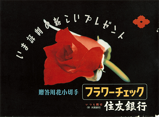
Poster for "Flower Checks," a type of personal check decorated with flower motifs, at Sumitomo Bank (c. 1952-1960). |
As a future graphic designer, Shichiro Imatake couldn't have picked a better place (Kobe) or time (1905) to be born. Located in western Japan, the port city of Kobe would soon become known for cultural imports like jazz and film, and having only reopened to the outside world in 1868, the country as a whole was in the midst of reinventing itself through rapid modernization. In this respect Shichiro Imatake: Pioneer of Japanese Modern Design (running through 6 December at the Otani Memorial Art Museum, Nishinomiya City, just a few kilometers east of Kobe), a retrospective of Imatake's career, serves as a handy overview of modern art and design in the 20th century as well as of major social trends in Japan.
Imatake came of age during the Taisho Era in the 1920s, just as the moga (modern girl) and mobo (modern boy) fads were taking hold. Influenced by early American screen stars like Harold Lloyd and Clara Bow, young people of the era embraced Western culture and fashion. These styles, known as Taisho roman (romanticism), were also linked to more lasting changes like the rise of democratic principles such as universal suffrage and greater personal freedom for women. Change was also afoot in the consumer market as long-established kimono dealers, anxious to keep pace with the times, expanded their operations to become Japan's first department stores.
 |
|
 |
|
|
|
|
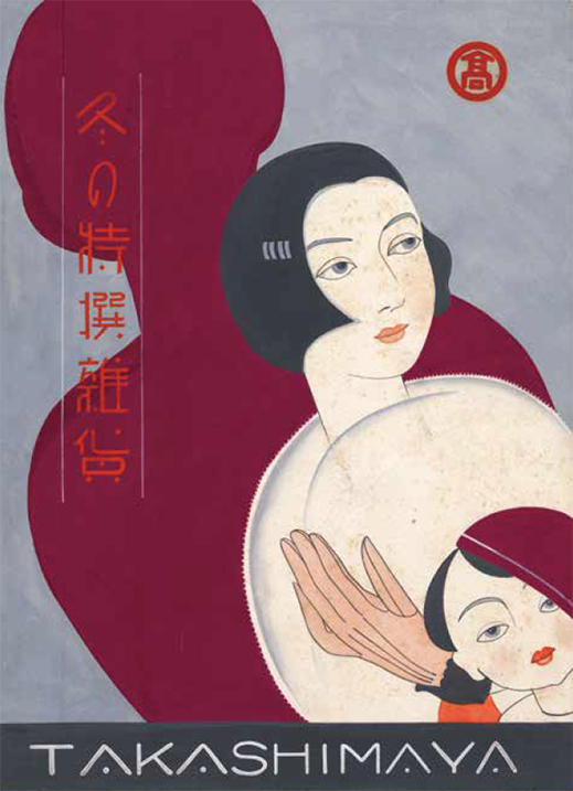
Original picture advertising miscellaneous winter goods at the Osaka branch of Takashimaya Department Store (1930s).
|
|
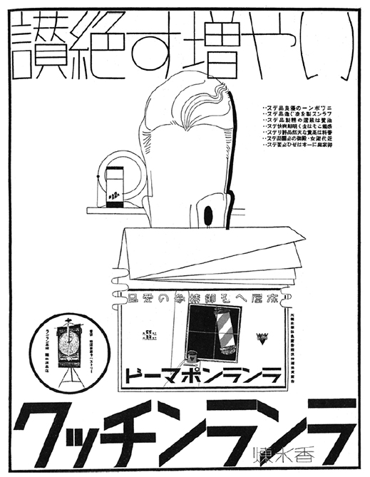
Newspaper ad for the Fukuda Gen Store, manufacturer of Ran Ran Pomade and other hairdressing products (c. 1934-1943). |
After creating several covers for small literary magazines, Imatake found steady employment in 1927 as a designer at Kobe's Daimaru Department Store, where he created posters, ads, and window displays. A few years later, in 1931, Imatake moved on to the newly opened Nankai branch of Takashimaya Department Store (another former kimono seller) in south Osaka, just as the city was starting to boom. (In the 1930 census, Osaka overtook Tokyo to briefly become Japan's most populous city.) Imatake's floor guides and store catalogues for Takashimaya were overt advertisements for the modern lifestyle. In the designer's snappy line drawings, women in kimono sported bobs and flapper hats, and men favored fedoras with bold striped suits. Imatake's use of cinematic angles and somber colors gave these works a chic but slightly forbidding look.
Like many artists of the age, Imatake was forced to turn his hand to propaganda during World War II. Adopting an uncharacteristically realistic style, he painted battleships, flags, and portraits of soldiers for such magazines as Nippon: Today & Tomorrow and Boy Aviators of the Army Air Corps.
Immediately after the war, however, Imatake opened his own design studio in Kobe before moving it to a new site directly across the street from the Daimaru Department Store in Osaka in 1947. It was during this period that he became the art director and design consultant for Sumitomo Bank, one of the first banks to develop a network of branches across the country. Many of Imatake's advertisements for the company featured the smiling faces of school-age boys and girls alongside heartfelt appeals to parents to secure their children's future by opening saving accounts for them.
 |
|
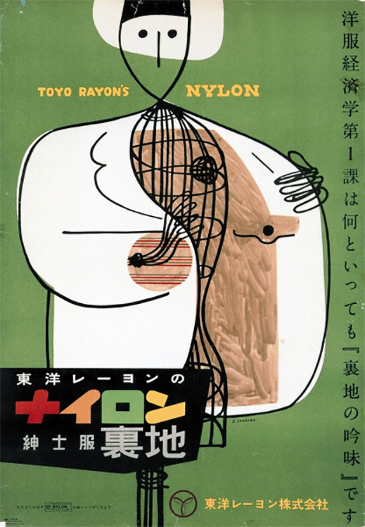
Poster for nylon linings for menswear made by the Toyo Rayon company (1952).
|
With abstract shapes, brilliant colors, and an occasional hint of Miró or Picasso, Imatake's postwar work clearly references modern art. One handsome advertisement for Toyo Rayon, a manufacturer of nylon umbrellas, raincoats, and inner linings for garments, centers on a roughly drawn dress form. Despite its wire body, the form appears to be some sort of human figure (note the balled-up wire heart) showing off the inside of its jacket. The hand-painted quality of the lining strikes a contrast with the solid white exterior of the garment and the warm green of the background, and the multi-colored katakana letters that spell out "nylon" draw the viewer's eye into the scene.
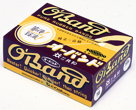
Foremost among Imatake's designs is the O'Band rubber band package, a yellow-and-brown box first introduced in 1951. In a clever synthesis of form and function, a thumb and index finger in the upper right corner of the box are shown pulling a rubber band taut around a perforated circle which, when punched out, allows easy access to the bands inside. The brand name (recalling an Irish surname) at the top dominates the Japanese text, and a catchy English slogan on the side neatly sums up the product: "Neater! Quicker! Cheaper! than string." Manufactured by Kyowa -- an Osaka-based company that chopped up bicycle inner tubes to produce Japan's first rubber bands in 1923 -- the O'Band brand can still be found in offices all over the country. Imatake's design was recognized with a Good Design Award in 2013, more than a decade after his death.
 |
|
Package for Kyowa Limited's O'Band rubber bands (1951).
|
Imatake's design for Mentholatum, a line of lip balms, muscle rubs, and other medicinal creams made from menthol, remains a familiar sight in any drug store. The brand's trademark, also dating to 1951, features a picture of the Little Nurse, a young girl clad in a nurse's uniform who bears a close resemblance to Shirley Temple, preparing to open a can of Mentholatum. The character entered the digital age in 2014 as a stamp available for free download on the popular Line social-media application.
Imatake's countless other creations include the logo (made up of two curved red lines that intersect near both ends) for the Kansai Electric Power Company, an early hawk-shaped symbol for the Nankai Hawks baseball team, and a classic package design for the Hakutsuru sake brewery, auspiciously decorated with white origami cranes on a red lined background.
In later years, after moving to Nishinomiya (located about halfway between Osaka and Kobe), Imatake designed postage stamps and maps for the city. As a sideline, he continued to paint -- a skill he had begun to study in the '30s, having never received a formal education in art. The last room in the exhibition contains a number of Imatake's paintings, created between the early '60s and late '90s. Incorporating techniques from Op and Pop art and well-known motifs from art history, these works show that Imatake was just as aware of current trends at the end of the 20th century as he was at the beginning. Perhaps that is what makes his designs so timeless.
All designs by Shichiro Imatake; all photos provided by the Otani Memorial Art Museum, Nishinomiya City.
|
|
 |
Christopher Stephens
Christopher Stephens has lived in the Kansai region for over 25 years. In addition to appearing in numerous catalogues for museums and art events throughout Japan, his translations on art and architecture have accompanied exhibitions in Spain, Germany, Switzerland, Italy, Belgium, South Korea, and the U.S. His recent published work includes From Postwar to Postmodern: Art in Japan 1945-1989: Primary Documents (MoMA Primary Documents, 2012) and Gutai: Splendid Playground (Solomon R. Guggenheim Museum, 2013). |
|
|
|